Games ‘Gotham Knights’ May Have The Worst UI In A Generation Paul Tassi Senior Contributor Opinions expressed by Forbes Contributors are their own. News and opinion about video games, television, movies and the internet. Following New! Follow this author to stay notified about their latest stories.
Got it! Oct 22, 2022, 10:50am EDT | New! Click on the conversation bubble to join the conversation Got it! Share to Facebook Share to Twitter Share to Linkedin Gotham Knights LegacyKillaHD Gotham Knights debuted this week to middling/poor reviews, and with a 69 Metascore , is one of the worst-reviewed major games of 2022, this side of the Saint’s Row reboot and Babylon’s Fall. Reviewers cite lackluster performance where the game can struggle to even hit 30 fps on next-gen consoles or PC, and also the overly grindy, repetitive structure. But one thing stands out above the rest, at least from an outside perspective.
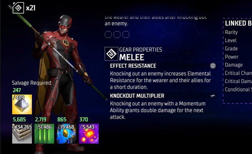
This genuinely may be one of the worst UIs I’ve seen in a game…ever. And that’s saying something. I have no idea what exactly happened with the user interface of Gotham Knights, but it absolutely feels like something that was more meant for a mobile game than a full release on console and PC.
Gotham Knights WB The fonts are enormous and ugly. The icons are uninspired or bizarre. There are frequent, yawning blank chasms.
The game even handles line breaks weirdly. I’ve genuinely never seen anything this immediately off-putting before. MORE FOR YOU Patrick Byrne Of Overstock Fame Says He Was Involved In Monthslong Effort To Overturn 2020 Election Russia Urges Kherson Evacuation Amid Warnings Of Imminent Ukrainian Counteroffensive How Failed Leaders Make Successful Comebacks: Boris Johnson And The Savior Strategy UI is something rarely talked about in games, but it’s a key element of all them.
Games like The Last of Us are well known for extremely minimal UI, while other games like MMOs have to balance between a ton of information and making it coherent. One of my favorite UIs in recent memory is actually Amazon’s New World, which handles the burdens of MMO information delivery with grace. Gotham Knights is…the polar opposite of that in every way, trying to balance material hoarding, gear grinding and skill tree unlocks within the world’s ugliest menus.
In actual gameplay the UI isn’t so bad because there isn’t all that much of one. But once you’re inside those menus trying to do everything, yikes. Gotham Knights WB The poor UI is part of a growing conspiracy theory that Gotham Knights is actually a mobile game that was converted into a console/PC release instead.
Players cite the mobile-like UI, the inability of the game to pass 30 frames on any platform and the grindy nature of it, which seems suited for mobile. As bad as this is, I don’t buy it. Granted, directions of games can shift, but left turn from a mobile offering to a AAA console and PC release? I doubt it.
What I think happened here is that the game was originally planned to be more live-service-y than it is, but with Marvel’s Avengers being a cautionary tale, they opted out of fully going in that direction. So that’s why you see a lot of grindy elements but no actual microtransactions tied to any of these systems. Gotham Knights WB And I think the UI is just…a bad UI.
I don’t think it’s something designed for mobile that got ported over. I may be wrong, it’s just that seems exceedingly unlikely, no matter how it looks. Obviously Gotham Knights has larger issues past the UI, but don’t underestimate how a single screenshot like one of these could turn someone off to a game entirely.
I know that’s what happened to me when I first saw it. Follow me on Twitter , YouTube , Facebook and Instagram . Subscribe to my free weekly content round-up newsletter, God Rolls .
Pick up my sci-fi novels the Herokiller series and The Earthborn Trilogy . Paul Tassi Editorial Standards Print Reprints & Permissions.
From: forbes
URL: https://www.forbes.com/sites/paultassi/2022/10/22/gotham-knights-may-have-the-worst-ui-in-a-generation/
