Science Editors’ Pick Yes, It’s Getting Hotter — This Simple Graphic Explains Marshall Shepherd Senior Contributor Opinions expressed by Forbes Contributors are their own. New! Follow this author to improve your content experience. Got it! Jul 19, 2022, 07:25am EDT | New! Click on the conversation bubble to join the conversation Got it! Share to Facebook Share to Twitter Share to Linkedin As I type this, heat records are being shattered in Europe.
Minutes ago, the UK Met Office tweeted, “A temperature of 39. 1°C has provisionally been recorded at Charlwood, Surrey. If confirmed this will be the highest temperature ever recorded in the UK! Temperatures are likely to rise further through today.
” Paul Knightley is a UK-based meteorologist with DTN. He tweeted an equally startling dose of reality, “Provisional – but it appears the UK record has been beaten – and it’s not even midday BST. ” As hard as is it is to fathom, the unbelievable temperatures from the 2003 heatwave are being shattered in places like France, the United Kingdom, and Spain.
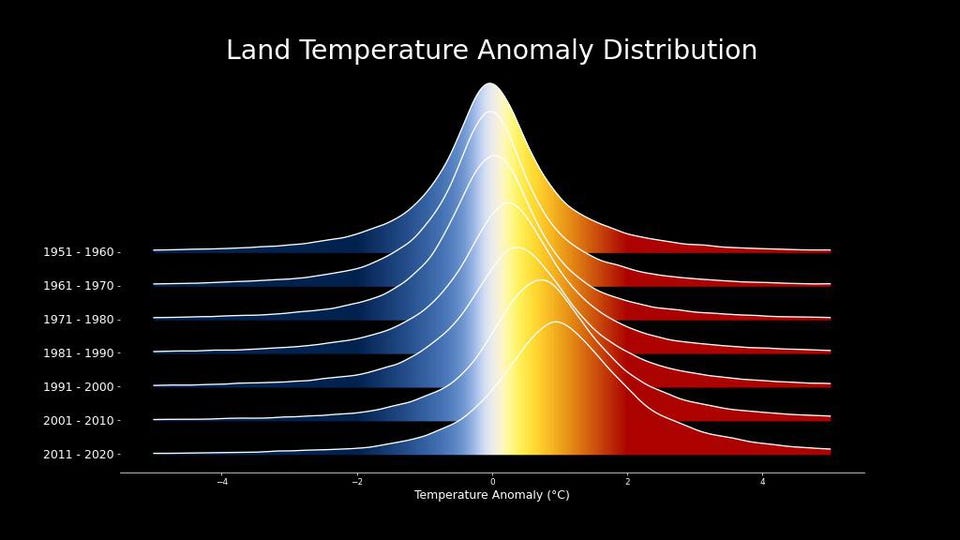
Estimates of 30,000 to 40,000 deaths were associated with the 2003 heatwave, and hundreds of people have already died in this current heatwave . By the end of the day, the United Kingdom may experience temperatures never recorded. A friend asked me if this type of heat will continue in future summers, this simple graphic suggests that the answer is yes, and it is likely to worsen.
Temperature distributions have shifted since the 1950s. NASA SVS Look, I know there are still a tiny, tiny fraction of people out there spewing “zombie theories” — narratives long refuted by the consensus scientific community, but they still live on through social media, grey literature, and YouTube. I also know that a few people will even utter the cliché statements like, “It’s Summer, it’s supposed to be hot” or “I have lived through worse heat.
” That’s probably the same person that walked uphill to school both ways as a child, but I digress. Yes, climate varies naturally, but there is a human modifier on top of it now. Grass grows naturally, but it grows differently when we humans add fertilizer.
MORE FOR YOU New Research Finds A Connection Between Domestic Violence And These Two Personality Disorders This Scientist Helps Andean Forests And Ecuador’s Women In STEM Exceptional Fossil Preservation Suggests That Discovering Dinosaur DNA May Not Be Impossible The NASA visualization above ( full animation ) clearly indicates something that climate scientists have understood for decades. The temperature anomaly (difference from some normal value) distributions are shifting. NASA’s website says, “As the planet has warmed, we see the peak of the distribution shifting to the right.
. . .
distribution of temperatures broadens as well. ” OK, what does all of that mean Dr. Shepherd? In a nutshell, it means average and median temperature has shifted to warmer values over the past 70 years.
NASA goes on to say, “Broadening is most likely due to differential regional warming rather than increased temperature variability at any given location. ” Manuel, 82, sits outside his house on a hot and sunny day in Barcelona, Spain, Saturday, July 16, . .
. [+] 2022. Many European countries are facing exceptional heat this month also attributed to climate change.
(AP Photo/Emilio Morenatti) Copyright 2022 The Associated Press. All rights reserved The “So What?” to all of this is that it represents a climate system with the possibility of warmer average and extreme temperature values (those values on the right tail of the distribution). Put a different way, an extreme temperature value in the 1951-1960 decade is closer to the center of the distribution today.
Climate scientist Zack Labe , a postdoctoral researcher at Princeton and NOAA’s Geophysical Fluid Dynamics Laboratory, tweeting about this graphic said, “Human-caused climate change is increasing the risk of hotter temperatures (like extreme heat waves) — watch the distribution move to the right. I’m afraid these headlines on record heat are not going away anytime soon. ” What concerns me is that the minimum temperatures have also shifted to the right.
Many of the heat-related deaths are associated with elevated nighttime temperatures, which in some cases are made worse by the urban heat island. In other words, the evening lows are, on average, warmer, and many of the most vulnerable people in our society will beat the brunt inevitable health disparities. Once again as I searched for stock photos of heat for this article, I mainly found people playing in water fountains or lounging at the beach.
The narrative of extreme heat coverage must change, but that is an essay for another day. Follow me on Twitter . Check out my website .
Marshall Shepherd Editorial Standards Print Reprints & Permissions.
From: forbes
URL: https://www.forbes.com/sites/marshallshepherd/2022/07/19/yes-its-getting-hotterthis-simple-graphics-explains/
