It’s a gimmick. Yet I always fall for it. Every year at this time paint companies announce their (cue the drumroll) Color of the Year, or COTY, as insiders call it.
They roll out the paint color they most want you to roll on your walls — or ceilings or cabinets. Though I have never actually painted anything a COTY, I eagerly await these announcements, which are like the Oscars for color. Except, unlike the Oscars, COTYs are not chosen in retrospect.
Rather, color judges look at what is going on in the world ─ socially, artistically, politically ─ to divine what will be the next most-coveted color, the one consumers will feel like living with or in. Whether COTYs accurately predict trends is hard to say. However, what’s is clear, and more interesting to me than any single paint company’s COTY, is what all the collective COTYs in a given year say about future (and past) color trends.
Two years ago, for instance, while the world was in the throes of COVID, most paint companies selected a shade of healing green. Last year, prominent picks for 2023 were invariably intense saturated tones of teal, brick and charcoal. Nothing wimpy, these colors reflected determination.
This year, the 2024 COTY picks touch all four compass points. We have one light, one dark, one warm and one cool. Equally telling is what’s absent: Gray has had its day.
Here’s a sampling, along with a little paint speak from their spokespeople. On the lighter side, Glidden paint by PPG announced Limitless (PPG1091-3) “a fresh, warm hue” that is “anything but yellow. ” Color stylists reacting to the choice used the words “pancake” and “bougie beige” to describe the honey-butter hue.
“This modern neutral is as adaptable as its name implies and is taking the place of cool neutral tones that are so last year,” said Ashley McCollum, PPG’s color expert for Glidden. “With the selection of Limitless, gray is officially canceled. ” That’s not a bad thing.
On the dark side, Behr Paint Co. anointed Cracked Pepper (PPU18-01) as its 2024 COTY. Described as a “soft black,” Cracked Pepper “is a color that empowers and elevates your senses, and the way we feel in a space,” said Erika Woelfel, the brand’s vice president of color.
“From heightening the aromas of a dining room or the feeling of softness in a living area, Cracked Pepper enhances the natural expression in any space. ” This would take some courage. On the warm side, HGTV Home by Sherwin-Williams declared Persimmon (HGSW6339) as its 2024 COTY.
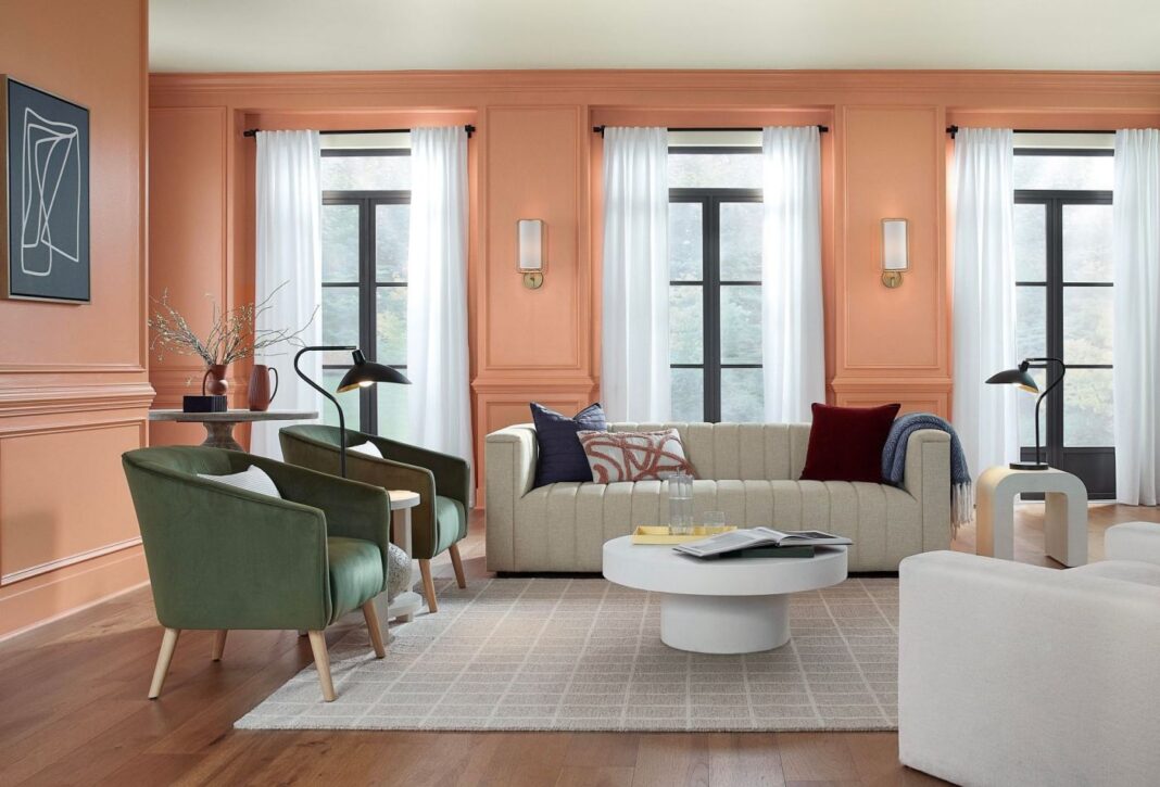
“A warm, earthy and energetic terracotta shade that combines the elevated energy of tangerine with grounded neutral undertones,” Persimmon pairs well with neutrals or can stand on its own, say its promoters. “We have seen these tangerine tones emerging in consumer trends and decor,” said Ashley Banbury, the brand’s color marketing manager. Maybe in small doses.
On the cool side, Valspar deemed Renew Blue (8003-37D), “a tranquil light blue shade with touches of grayed sea green,” as the color for 2024. Renew Blue emphasizes “control, consistency, and equilibrium,” said Sue Kim, Valspar’s director of color marketing. “Our home is a space where we are creating a sense of comfort and slowing down.
Renew Blue sets a restful mood. ” Maybe in a nursery. However, if you ask me (and no one did) they all missed it.
Fancy forecasting formulas aside, the COTY is … Barbie Pink. Whatever you think about the colors, the fact is you’re thinking about color, which is exactly what the paint companies want. They also want to encourage you to look beyond your four walls and use paint to color your home creatively.
Here are six ways to do that: If a new color feels too daring indoors, try painting your patio or porch with the exterior version of the shade. Most rooms have color on the walls and white or cream ceilings. Try flipping that by putting color on the ceiling and leaving walls neutral.
We expect white or wood cabinets. However, cabinets painted a definite shade of blue, green, coral or black provide an unexpected and updated change. Think floor-to-ceiling color will be too much? Paint the lower half of a room in a color and leave the upper half neutral.
Color drenching is the term for painting everything in a room — baseboards, trim, wainscoting, walls, doors and ceiling — the same color. Just as certain wine-and-food pairings bring out the best of both, the same is true of colors. Paint companies have palettes of colors curated to go together.
.
From: eastbaytimes
URL: https://www.eastbaytimes.com/2023/08/31/and-the-2023-color-of-the-year-is-light-dark-warm-and-cool/


