You can fill your home with custom furniture and museum-worthy art. But a growing body of psychological research suggests that if you want your rooms to enhance your health, no factor carries more weight than how you use color. “The science shows that you can make particular moods more or less likely with color, and that you can actually influence how peoples’ minds work,” says Sally Augustin, a practicing environmental psychologist, author and principal at Design With Science .
“Color can be a powerful and useful tool in anyone’s home. ” These impacts on human emotion are so significant that researchers at the University of Lausanne in Switzerland have spent the past five years conducting the ambitious International Color-Emotion Association Survey. The 12,000 responses they’ve recorded from 90 countries indicate an indelible—and universal—link between the colors around us and our moods.
And because the shades in your home can relax you, energize you or even make you feel happy, notable designers are drawing clients away from the long-prevailing minimalist palette of neutrals and toward more vibrant hues. Try the Instagram pages of creatives such as Rayman Boozer , Jessica Davis and Corey Damen Jenkins for proof or inspiration. India Mahdavi’s Project Room series showcases her irreverent use of color.
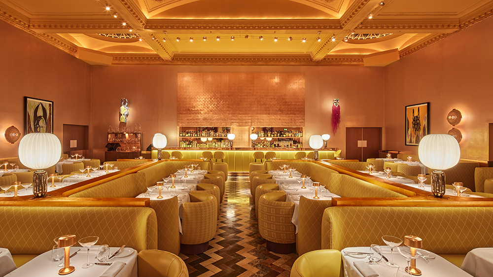
François Halard Perhaps no space symbolizes this shift more than the Gallery at the London restaurant Sketch , arguably one of the most recognizable dining rooms in the world. India Mahdavi , the Paris-based interior designer responsible for its look, set social feeds alight in 2014 when she bathed the space from floor to ceiling in pale pink—a color known for its calming energy. This year, when the eatery welcomed a new installation from British Nigerian artist Yinka Shonibare , Mahdavi followed his lead and drenched the room in canary yellow.
“Yinka’s artwork was a real inspiration and enticed me to work differently,” Mahdavi tells Robb Report . “I used elements that have allowed me to extend Yinka’s artistic exploration of culture and identity—and bring a warm feel of Africa to the space and furnishings. Warmth is the new color at Sketch.
” Mahdavi, one of a number at the forefront of this movement, says she’s always looking for the perfect dialogue between color and space. “I often speak of my colors as an alphabet, a grammar,” she says. “They are my secondary mother tongue with which I seek to celebrate joy; I want the places that I invent to carry energy.
” But practitioners of color psychology will tell you that choosing a mood for your rooms is not as simple as “blue is calming, red induces anger. ” Each color contains three distinct components to consider: hue, value and saturation. Hue represents its dominant visible wavelength (blue, for example), while value refers to the relative lightness or darkness (light blue).
Saturation dictates the level of intensity (powdery sky blue). Each can shift how we perceive that color, both visually and mentally. A shade with less saturation and higher value can be calming: A light, dusty blue or green, for example, is ideal for a bedroom.
If the goal is to be energized by your living space, Augustin recommends colors with higher saturation and less value, such as sapphire blue and emerald green. Patchwork curtains from Les Crafties punch up another Mahdavi design. Simone Bossi Color psychology extends beyond those three components as cultural implications and the power of memory come into play.
For instance, in the US, shades of blue are typically associated with trustworthiness and dependability, which has led many prominent banks to use the color for their logos. According to new research by Zillow , making your front door black, a color associated with power and elegance, raises a property’s value by over $6,000. Not a bad ROI for a few brushes and a can of paint.
A word of warning, however: Augustin says there’s one color worth avoiding altogether. “Generally, I think of white spaces as an opportunity missed. And if the space is not only white but also relatively stark in terms of other elements present, you’re creating an environment that is really understimulating,” she says.
“It can actually be quite a stressful place for people to spend time in. ”.
From: robbreport
URL: https://robbreport.com/shelter/home-design/color-mood-interior-design-1234728029/


