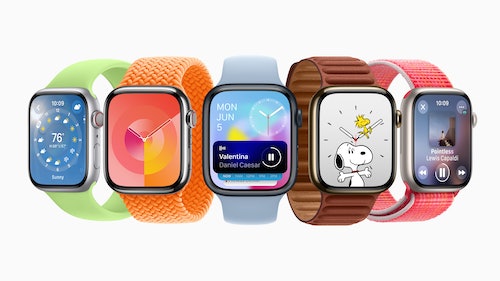
It’s all about widgets. With , Apple is up-ending how its smartwatches work yet again. The company introduced the new operating system update during a jam-packed WWDC 2023 keynote, but the changes here deserve specific attention.
The Apple Watch is in a very different place than it was when it started. The original smartwatch tried to be a little bit of everything, a phone on your wrist, a fitness band, and a weirdo communication device. Apple narrowed things down over time to health, fitness, notifications, and the occasional app, but watchOS 10 will make things a bit more complicated in a way that might be familiar to fans of .
Widgets Are Back WatchOS 10 is focusing on widgets in a big way. WatchOS 10 is going all in on widgets. Similar to , Apple Watches will now get an array of glanceable nuggets of information with just a scroll of the Digital Crown.
These appear in a new “Smart Stack” that intelligently pulls up widgets depending on what apps you use most often, the current time of day, or your current location. Another way of thinking about it is watchOS’ Siri watch face has become the default way Apple expects you to navigate its smartwatch. This change de-emphasizes watchOS’ list or grid of apps for what should be the most useful parts of those apps in widget form.
That’s not a complete abandonment of the watchOS App Store, but it does suggest Apple expects you to interact with the Smart Stack first and use it as an app launcher rather than the old app-icon-driven way from before. Big Screen Apps The new Music app uses the whole Apple Watch screen. The introduced a much bigger screen size to watchOS, and few experiences outside of larger watch faces to take advantage of it.
Smartwatch screens seem like they’re only going to skew larger, just like smartphones, so it makes sense that watchOS 10 would try to accommodate them. Almost all of Apple’s apps are getting updated to use the full-screen of the watch rather than rely on black backgrounds and borders. If I could describe the brief glimpse Apple gave, it’s almost like watchOS’ apps have become iOS widgets themselves.
The Weather app goes to the edges of the display and features the animated backgrounds that first appeared in the iOS and iPadOS versions, The Music app shows album art and a menu for connected Bluetooth devices, and the Messages app will show your regular contacts. It’s a subtle change, but it does seem to make the Apple Watch more information-dense and theoretically more useful. Health and Fitness WatchOS 10 is still chasing Garmin watches, but now it at least has topographic maps.
Apple’s making dozens of tweaks to the health, wellness, and exercise features of the Apple Watch, but the biggest is a new topographic map and elevation view for hikers, the ability to log your “state of mind” to track emotional well-being in the Mindfulness app, and a way to track the amount of time you spend in daylight using the Apple Watch’s ambient light sensor. Release Date WatchOS 10 will launch later this Fall, presumably alongside new watches. A beta version of the update is available today and should enter public beta this Summer.
.
From: inverse
URL: https://www.inverse.com/tech/watchos-10-apple-watch-widgets-smartwatch


